Payment terminals renting
process
This project was carried out during my experience at Banco Safra, in which I worked on Safrapay , the bank's payment method product. Until then, the journey to acquire SafraPay machines was exclusively aimed at the corporate and MEI segment, but the business need arose to extend the online purchasing experience to larger companies . Therefore, in partnership with the product and development areas, a new journey was created to meet the specific account opening needs of larger companies.
My role
My role in the project was the development of all wireframes and high-fidelity prototypes, as well as documentation for the development team. The entire project was carried out under the supervision of the team's Design Manager.
The problem
How can we modify the current online purchasing journey to enable the accreditation of larger companies?
Previous journey
The existing journey had a specific focus on the PJ/MEI public and individuals, therefore the form was less extensive.


However, despite being optimized to make ordering the machine as easy as possible, the previous journey had some areas for improvement, especially on the last page before conversion, the order summary.
Heuristic analysis

There is an excess of information on the order summary page, which is particularly negative given that it is the most critical point in the journey.

There is a 35, 45% exit rate at this stage of the form, according to Google Analytics data.
Hypothesis about detractors:
- Hesitation when looking at the fees in the order summary;
- Excess of information;
- There is also an excess of secondary actions to be done.
Project requirements
-
Ser uma alternativa viável à jornada de compra mediada por um vendedor;
-
Possibilitar a coleta de todas as informações necessárias para abertura de conta da empresa;
-
Ser simples e sem muitos atritos para facilitar a experiência do cliente e gerar mais credenciamentos para a empresa.
The chosen solution
Important points of the project
1- Company billing method
The monthly billing declaration modal was the solution chosen to “filter” the ideal customer of the journey , while at the same time reinforcing to the user that they must earn more than R$60,000 (fictitious number) to be eligible to order the machine. card.
By inducing the user to choose which situation they fit into, we have a greater guarantee that they are aware of the requirements for the offers.

![[1.0]Jornada_SafraPay_EMP_Vitrine (1).png](https://static.wixstatic.com/media/18312b_2b71000f919d4711977c7ec958c3ad37~mv2.png/v1/fill/w_208,h_600,al_c,lg_1,q_85,enc_avif,quality_auto/18312b_2b71000f919d4711977c7ec958c3ad37~mv2.png)
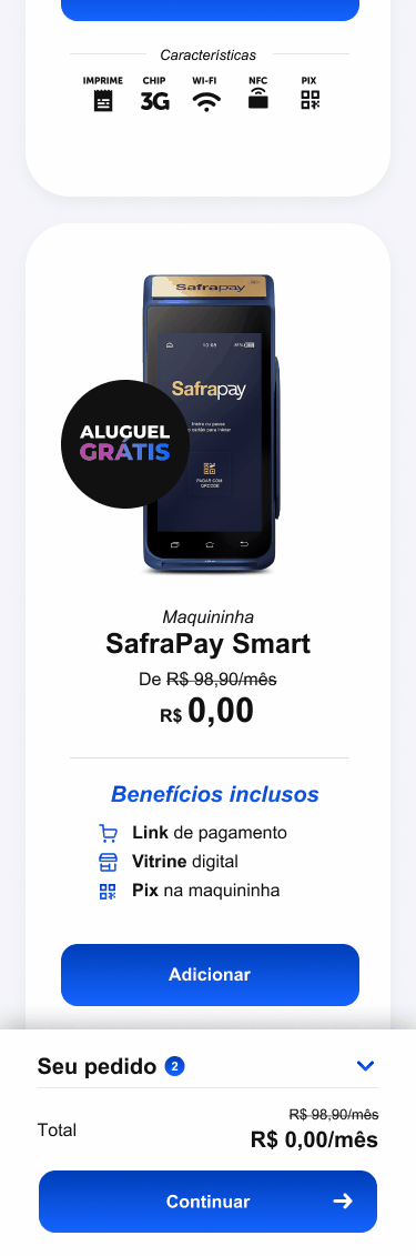
2- Card machine showcase
To highlight other offers in addition to the card machine, we chose to bring other important offers to the customer in the window, such as benefits included at no cost.
Another important point is the emphasis on “free rent”, which is a condition highly sought after by the public looking to hire a payment method.
To reinforce the free condition, we highlight the “free” and the cost of R$0.00 . But the condition for the offer comes in a disclaimer just below the price , highlighting the need to sell from R$5,000 per month.
3. Shopping Cart
An important feature of the new journey was the addition of a shopping cart , due to the characteristics of larger companies needing more machines in the same establishment.
However, a major limitation for the project was the business need to limit the order to a maximum of 3 machine units , which goes against the common logic of an e-commerce shopping cart and can cause frustration for the user .
Therefore, the decision to alleviate user frustration was to add a disclaimer near the checkout button , in addition to automatically expanding the cart once the limit is reached , so that the user knows to proceed with the order.
![[1.0]Jornada_SafraPay_EMP_step4.png](https://static.wixstatic.com/media/18312b_1c1175c86c784893b4864a65ab9abc25~mv2.png/v1/fill/w_194,h_600,al_c,q_85,enc_avif,quality_auto/18312b_1c1175c86c784893b4864a65ab9abc25~mv2.png)
4. Billing Commitment and Fees
One of the new steps added to the new journey was declaring how much the user intends to earn with the Safrapay machine .
This functionality represented a challenge for the design process, since the offer works as follows: the higher the revenue, the lower the fees charged.
Therefore, the customer would be inclined to promise more than they will actually do to get the best offer.
Therefore, our choice was to bring a disclaimer highlighting the importance of complying with the chosen value .

5. Order summary
The order summary step, already existing in the old journey, was remodeled to ensure more organization and more hierarchy, leaving the screen less dense with information , in order to avoid possible detractors at the most decisive moment of purchase.
Another important change was leaving the contracted rate information closed by default in the accordion list , since the customer already saw what their rates would be in the previous step of the journey.
As the contracted rates are like the “price to be paid” for payment method customers, bringing this data back makes the user think twice about the order.

6. Next steps
Finally, after completing the order, the customer must still complete some steps to open an account.
To keep the user informed about the next steps, the solution was to create a progress bar in order to give the user visibility of where they are and what the next steps are, according to the system status visibility heuristic ( Jacob Nielsen).
Metrics and results
To track the results of the new journey, the following should be monitored:
-
Number of completed orders;
-
Number of customers who completed the documentation submission;
-
Number of machines shipped and activated;
-
Number of sessions for each stage;
-
Time spent on each stage;
-
Analysis of user behavior on Hotjar to detect friction points.
In general, the purpose of the new journey is to generate more conversions with lower CPC (cost per customer), as until now, the journey for customers with higher revenue companies was done 100% through employees who visited the customer, either in person or via call/WhatsApp, generating much higher costs for the business.